Intended Audience: Ecommerce Managers, CSMs, Merchandisers
Purpose: The Design tab in LyveCom allows you to control the look and feel of your video displays—whether you're embedding a Carousel, Bubbles, or Grid. Use these controls to align your shoppable video content with your brand’s style, optimize engagement, and enhance the customer experience.
Customizing in the Design Tab
Match your playlists to your brand.
The Design tab lets you tailor Carousels, Bubbles, and Grids for visual consistency and elevated customer engagement.
Carousel Design Options
Great for: Homepage features, UGC showcases, tutorials
Carousels span the full page width and are ideal for displaying multiple videos in a scrollable format.
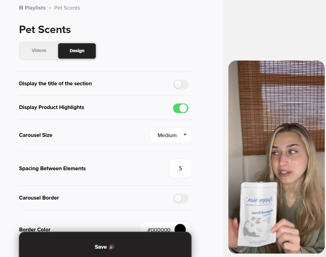
Customize in the Design Tab:
- Show/Hide Section Title
- Product Highlights
Toggle ON to display product links beneath each shoppable video. - Carousel Size
- Spacing Between Videos
Set spacing between 0–99
Carousel Border Options:
Toggle ON to enable a border around the entire carousel.
If ON, you can adjust:
Border Color
Use the HEX color picker or input a HEX codeBorder Size
Recommended: 10 or lower for subtle bordersBorder Radius
0 = square corners, 99 = fully rounded
Bubbles Design Options
Great for: PDPs, FAQs, buyer concerns
Bubbles are small, round videos perfect for embedding in product descriptions or educational sections.
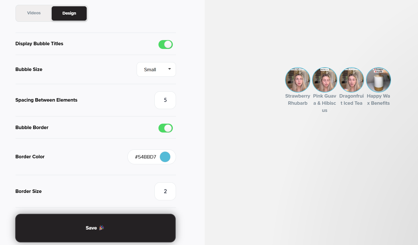
Customize in the Design Tab:
Show/Hide Section Title
Bubble Size
Spacing Between Bubbles
Bubble Border
Toggle ON/OFF
If Border is ON:
Border Color
HEX input or color pickerBorder Size
Recommended: 10 or less for subtle styling
Grid Design Options
Great for: Clean galleries, visual product storytelling
Grids show multiple videos in a uniform layout with customizable spacing and borders.
Customize in the Design Tab:
Show/Hide Section Title
Grid Size
Spacing Between Videos
Set spacing between 0–99
Grid Border Options:
Toggle ON to enable a border around each video in the grid.
If ON, you can adjust:
Border Color
Use the HEX color picker or enter a HEX codeBorder Size
Recommended: 10 or lower for a clean lookBorder Radius
Suggested: 5–15 for light rounding; 0–99 supported
Quick Styling Tips:
Subtlety is key—borders set to 10 or under tend to look clean and polished.
Use Border Radius to soften sharp edges and match your brand aesthetic.
Toggle Section Titles ON to add clarity, or OFF for a minimalistic feel.
Have more questions? Reach out to our support team - we’re happy to help!
Happy selling! ✨
Was this article helpful?